Have you ever used colour labels in Lightroom to organise your photos?
It may surprise you that these colour labels are actually not what they are called. There is no colour assigned to a photo, it is a string containing the name of the colour.
You can easily try it yourself. Open Lightroom, choose a photo and set the colour label to red by hitting “6” on the keyboard. Depending on your settings, Lightroom will display a red frame around your image, add a reddish background or show a red square beneath the image in grid view. Once you did that, open the metadate panel, choose the default display and observe the field called “Label”. What do you see? The text “Red”, not the colour.
You can edit this field. Try typing “Green” and observe the colour marking change. Of course you can type in anything you like. Say you want to mark an image as approved, just type in “Approved”. No colour shows up? Well, what did you expect?
Colour Label Sets
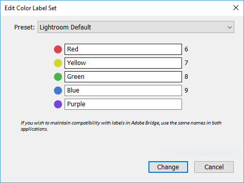
If the field “Label” contains just text, how does Lightroom know it is supposed to display a colour? How does this work for different languages? You might write “Yellow” for yellow, I’d write “Gelb” in my mother tongue, still we mean the same colour. The key is a colour label set. You will find it in the menu under “Metadata – Color Label Sets”. Lightroom comes with three predefined sets: “Lightroom Default”, “Bridge Default” and “Review Status”. Select “Lightroom Default”, open the Menu again and klick “Edit…”. You will see this:
That is the complete secret. Lightroom reads the field “Label” and checks the currently selected colour label set to see whether there is a colour to display for the text found. You can use any text you like. The two other default sets use other text and are good examples for what you might want to use this for. You can create and save you rown colour label sets as well.
By the way, switching the colour label set does not alter the label-fiels. So you can use different sets for different purposes and switch between those. Only thing to keep in mind: there can only be one label per photo. So if you mark a photo as Red with the “Lightroom Default” set, then switch to “Bridge Default” and use the colour label yellow to mark the same photo as second choice, the metadata will only contain the word “Second” – the first colour label is gone.
I’ll leave it to you to find out what happens if you switch languages.
Mit einem einfachen Trick eine deutsche Tastaturbelegung mit englischem Lightroom benutzen.
Die Herausforderung
Weil ich bevorzugt englischsprachige Fotoseiten lese und auch eine Menge Foto-Lehrbücher in dieser Sprache besitze, bevorzuge ich ein englisches Lightroom. So spare ich mir die Suche nach der deutschen Bezeichnung für einen Begriff, der z. B. in einer Anleitung verwendet wird. Bei Photoshop halte ich es genau so, doch darum soll es hier heute nicht gehen.
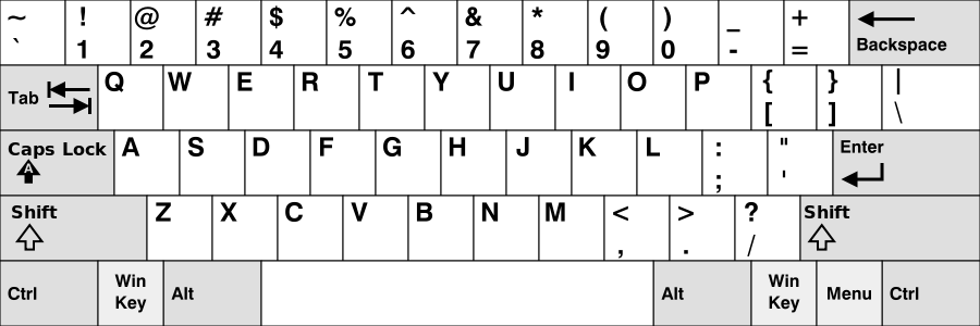
Die Herausforderung ist, dass Adobe leider mit dem Sprachwechsel auch die Tastaturbelegung wechselt. Es ist nicht vorgesehen, ein Tastaturlayout separat einzustellen. Tasten, die auf einem englischen Layout bequem sind, liegen auf der deutschen Tastatur unmöglich. Zum Beispiel der Backslash “\” oder die eckigen Klammern “[” und “]”. Sie liegen in der US-Version direkt nebeneinander und sind ohne Kombination mit anderen Tasten erreichbar:
„KB United States-NoAltGr“ von Diese Datei wurde von diesem Werk abgeleitet: KB United States.svg. Lizenziert unter CC BY-SA 3.0 über Wikimedia Commons – https://commons.wikimedia.org/wiki/File:KB_United_States-NoAltGr.svg#/media/File:KB_United_States-NoAltGr.svg
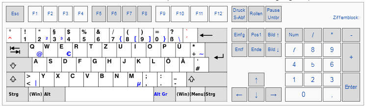
Für uns Deutsche sieht das anders aus, alle drei Tasten sind nur per Kombination mit Alt Gr erreichbar.
Quelle: Wikipedia
Die “Lösung”
Bei einem Sprachwechsel wird in Lightroom auf eine andere Sprachressourcedatei umgestellt. Die Datei für Deutsch ist bei einer Installation von Lightroom Classic CC zu finden (unter Windows, hab leider keinen Mac zum Testen): %Program Files%\Adobe\Adobe Lightroom Classic CC\Resources\de\TranslatedStrings_Lr_de_DE.txt.
Es gibt erwartungsgemäß keinen Ordner und keine Datei für die Sprache Englisch (en). Interessant ist aber, dass diese, wenn es sie gibt, berücksichtigt werden. Das kann man leicht ausprobieren, indem man den Ordner …\Resources\de kopiert und in …\Resources\en umbenennt, die Datei TranslatedStrings_Lr_de_DE.txt zu TranslatedStrings_Lr_en_US.txt umbenennt und danach eine englische Version Lightroom startet. Es werden jetzt nicht nur die deutschen Anzeigetexte verwendet, sondern auch die Tastaturbelegung.
Die Datei selber ist eine reine Textdatei. Hier mal ein Auszug aus dem Inhalt:
Die rot hervorgehobenen Zeilen sind interessant. Es werden offensichtlich Tastaturbelegungen vorgenommen. Was liegt also näher als alle Zeilen, die nichts mit Tastaturbelegungen zu tun haben, aus der Datei zu werfen und diese dann für das englische Lightroom zu verwenden? Nichts, genau so funktioniert es.
Bei Bedarf lassen sich dann gleich noch ein paar unglücklich gewählte Belegungen korrigieren und ein paar wenige Texte anpassen, fertig ist die eigene Tastaturbelegung für deutsche Tasten an englischem Lightroom.
Umsetzung
Einen Download einer fertigen Datei möchte ich an dieser Stelle nicht abieten, weil
ich meine persönlichen Vorlieben in meine eingebaut habe, die nicht jeder teilen mag,
die Datei von der Version von Lightroom abhängen dürfte und
ich nicht sicher bin, wie begeistert Adobe wäre.
Löschen überflüssiger Zeilen mit Notepad++.
Ich will nicht die deutschen Texte, sondern nur die Tastaturbelegung. Also müssen alle Zeilen raus, die nichts damit zu tun haben. Man kann das Löschen von nicht benötigten Zeilen mit Suchen und Ersetzen mit regulären Ausdrücken deutlich erleichtern. Ich habe alle Textteile mit notepad++ gelöscht, auf die folgender Ausdruck passte:
Es gibt einige verbliebene Zeilen, die deutsche Begriffe enthalten, die der Anzeige der aktuellen Tastenbelegungen auf dem Hilfeschirm, den man mit Strg+< erreicht, dienen. Es erscheint mir sinnvoll, die hier auftauchenden deutschen Begriffe durch die englischen zu ersetzen, also:
Command statt Befehl
Delete statt Löschen
Option statt Wahl
Enter statt Eingabe
Backspace statt Rücktaste
Shift statt Umschalt
Right Arrow statt Nach-rechts-Taste
Left Arrow statt Nach-links-Taste
Up Arrow statt Nach-oben-Taste
Down Arrow statt Nach-unten-Taste
Ctrl statt Strg
Tab statt Tabulatortaste
Space statt Leertaste
Abschließend
Danach ist die Anzahl der Zeilen, die man manuell löschen muss, überschaubar. Man findet sie leicht beim Durchscrollen, und man kann ja auch rasch korrigieren, wenn man dann doch einen vergessenen deutschen Text in der Lightroom-Oberfläche findet.
Natürlich braucht man immer noch nicht wirklich alle verbleibenden Zeilen aus der Datei. Da, wo die englische Originalbelegung gut funktioniert, muss man nicht korrigierend eingreifen. Es ist viel einfacher, alle Zuordnungen aus der deutschen Datei zu übernehmen, als mühselig herauszusuchen, welche man braucht.
Wenn man will, kann man jetzt noch Belegungen anpassen. Aktuell gibt es aber für meinen Geschmack gar nicht mehr viel zu tun, die echten Fehler sind inzwischen behoben, nur ein paar Anzeigen auf den Hilfeschirmen passen noch nicht so ganz. Kann man machen, muss man nicht.
Aktueller Stand
Zum Schluss noch meine aktuellen “Korrekturen” für Lightroom Classic CC 7.2:
“$$$/AgDevelopShortcuts/Create_Virtual_Copy/Key=Command + T”
“$$$/AgDevelopShortcuts/Rotate_left/Key=Command + ,”
“$$$/AgDevelopShortcuts/Rotate_right/Key=Command + .”
“$$$/AgLibrary/Help/Shortcuts/HideShowFilterBarKey=<”
“$$$/AgLibrary/Help/Shortcuts/Mac/HideShowFilterBarKey=<”
“$$$/AgLibrary/Bezel/FilterBarHidden=Press < to show the filter bar again”
“$$$/AgLibrary/Bezel/Mac/FilterBarHidden=Press < to show the filter bar again”
“$$$/AgLocation/Bezel/Filterbar/FilterBarHidden=Press < to show the filter bar again”
“$$$/AgLocation/Bezel/Filterbar/Mac/FilterBarHidden=Press < to show the filter bar again”
“$$$/Slideshow/Bezel/HeaderHidden=Press < to show the header bar again”
“$$$/Slideshow/Bezel/Mac/HeaderHidden=Press < to show the header bar again”
Soft Light is the one blend mode I read most nonsense about. Part of this may be due to the fact that vendors define the method differently, get quoted incorrectly and thus add to the confusion. Alas, I couldn’t find explanations for their particular choices, so I can only show what I figured out and present my own thoughts. (more…)
I already introduced the blend modes Multiplication, Linear Dodge, Linear Burn and Linear Light in the first part of the series. In this article I’ll add some more that might be interesting for photographers. For one particular blend mode there is a separate third part, beause it is rather complicated and frequently used: Soft Light.
Throughout the first parts of this series, I’ll deal with the math behind the blend modes only. I plan to use these as a reference in later articles treating more practical aspects and use cases. The retouching method that triggered my research has already been given its own article: Frequency Separation.
Notation
Let me introduce a notation for inversion in addition to the ones I already introduced in the first part. Let the inverted image for an image be . Inversion doesn’t mean anything else but subtraction of the brightness values of each pixel from 1. Thus:
.
Or short:
.
And now to the blend modes.
Color Burn
I am aware that it is slighly strange to explain something called Color Burn with black and white images. But as I said before, the math is what I will focus on first. The formulas are the same regardless or the number of channels. The formula for Color Burn is:
Color Burn
You will notice that the whole bottom-left half drowns in black.
Color Dodge
The counterpart to Color Burn.
Color Dodge
Here you get white for .
Screen
Another rather simple but nice one:
Overlay and Hard Light
Overlay and Hard Light are siblings. The formulas are for Overlay:
and for Hard Light:
Both are combinations of slightly modified Multiply and Negative Multiply.
OverlayHard Light
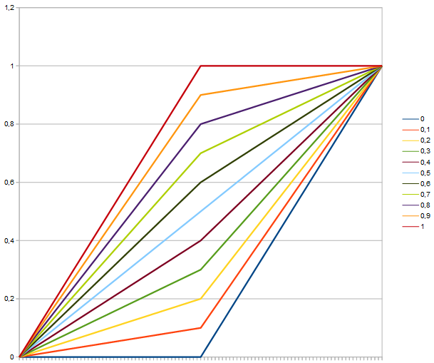
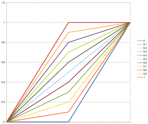
You may see it in the images, this is not a very smooth function. Plotting the brightness over a for different fixed b one gets the following:
Obviously not smooth. Make of it what you like.
50 % grey is neutral for both Overlay and Hard Light.
Vivid Light
Vivid Light can be seen as a combination of Linear Burn and Linear Dodge.

 be
be  . Inversion doesn’t mean anything else but subtraction of the brightness values of each pixel from 1. Thus:
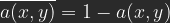 .
. .
.


 .
.