Skip to the content
Henkki Zakkinen Photographie
Toggle menu
Photos
Portfolio
Blog
Language
English (UK)
Deutsch
Photos
Portfolio
Blog
Language
English (UK)
Deutsch
Privacy Policy
About Me
Contact
Copyright
zakkinen
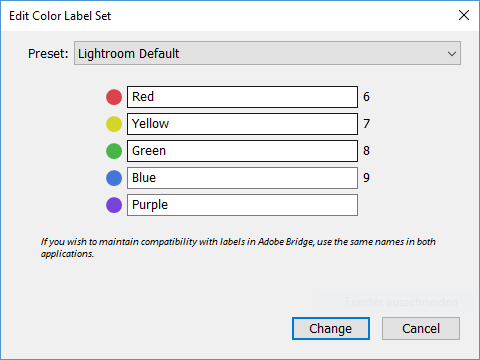
Colour Labels in Lightroom
Macros of Insects
Englisches Lightroom mit deutscher Tastatur
Photoshop Blend Modes - Part 3
Older